

How to View the CHAMPS Data Visualizations
How to View the CHAMPS Data Visualizations
Most CHAMPS graphs and figures contain multiple types of visualizations and different levels of data details, allowing you to look at Ending the HIV Epidemic (EHE) indicators from Mecklenburg County in various ways. Analyses in CHAMPS focus on adults and adolescents (people 13 years or older) living in Mecklenburg County. You may access totals for data variables. You may also look examine various subgroups of the adults and adolescents in Mecklenburg County, using different types of graphs or maps.
The Main Visualizations
Most data visualizations will appear as total line graphs, subgroup line graphs, bar graphs, or maps. The selection of these is interactive, and you may select the graph that best fits your preference and the data you are viewing (Fig 1).
Visualization Controls
The visualizations have several different types to controls to determine the visualization type, the data shown and the timespan displayed. On the left side of the panel, you will see several groups of control tabs, buttons or slider (Fig 1). Use these selection options to examine the data in different ways. Across the top (red rectangle) you can click on a tab to see the Total or demographic groups displayed. The top left line/bar tab (blue rectangle) lets you display the data as line graphs or as histogram bar charts.
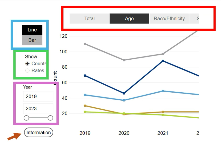
Fig. 1 Interactive Control Panel
Subgroups can be chosen by clicking on the demogrphics tab at the top (see red rectangle) or totals of all subgroups by clicking the Total Tab.
Many visualizations allow you to switch the data display from counts (i.e., number of people) to rates (i.e., people or events per 100,000 population per year), using the buttons inside the green rectangle on the left side. Click the radio buttons on the left side of the panel (Fig 1) to select counts or rates.
To vary the years included in the display, move the Slider Buttons under Year (purple rectangle) to define the earliest and latest years to be displayed. The left slider changes to the low end of the range shown, and the right slider changes to the high end of the range. Placing slider buttons on top of each other will display a single year of data.
Clicking the Information button in the lower left (brown arrow) will pop up a page that explains the visualization's technical information in more detail.
The available visualization choices will depend on the nature of the data being presented.
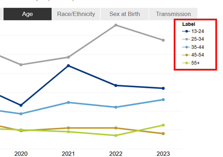
Fig. 2 Interactive Subgroup Selection Bar
Subgroup Displays
Subgroups (sub-populations of adults and adolescents in Mecklenburg County) can be selected by clicking on the tab bar across the top of the panel (see Fig 1). The Subgroup Selection Bar allows the viewer to examine different subgroups - Age, Race/Ethnicity, Sex defined at birth and Transmission tabs. Clicking on each tab in the Subgroup Selection Bar will display the selected category of subgroups and highlight the tab of the subgroup displayed in black. A subgroup color key is shown immediately in the upper right corner of the visualization (see Fig 2, red rectangle). Clicking on the Total Tab in the upper left will change the subgroup displays to the total, which will be displayed as a line graph. Not all visualizations will have a subgroup display option.
Since some subgroups may represent relatively few people, the counts of these subgroups may be combined to maintain individual privacy. For example, certain racial groups or age groups with low counts have been combined.
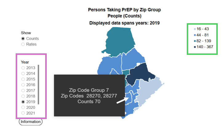
Fig. 3 Map Displays
Maps
Some visualizations can be displayed as Maps to show the geographic distribution of people or rates of indicators in the County (Fig 3). Areas on the map represent ZIP Groups, which are one, two, or three neighboring ZIP code areas where data are combined to avoid issues with small numbers. Select counts or rates using the radio buttons. Ranges of counts or rates are color coded and represent the range of the counts or rates shown in the scale box in the upper right (see green rectangle).
The Year of data represented in the map is selected using the radio buttons (see purple rectangle). Year ranges are not available because the selection of multiple years would result in double counting of people. A tool tip (black box) will display the ZIP codes for the ZIP Code Group by hovering the cursor over the ZIP Code Group. Hovering the cursor over a ZIP Group location on the map displays the ZIP codes and relevant counts or rates.
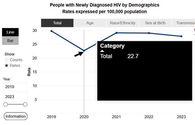
Fig. 4 Map Displaying Data for a Specific Time Period
Hover to Display Numeric Data
You can see specific data numbers or rates for a visualization by hovering the cursor (white arrow in Fig 3; black arrow in Fig 4) over a section of the visualization. In these examples, hovering the cursor over the point on the line (Fig 4) or a ZIP Code Group (Fig 3) will display the numbers or rates in a tool tip box. Hovering will produce similar results for multiple line graphs, bar charts, and ZIP Code Groups in maps.
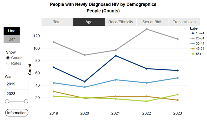
Fig. 5 Axes: Y=Count (Number) of Adults and Adolescents; X=Reporting Year
The X- and Y-Axes on the Graphs
For the line graphs (Fig 5) and bar charts, the X-axis will display events over consecutive years. The Y-axis will generally display counts of people or events, or rates per 100,000 population per year. In each instance, the Y-axis will be labeled. Be aware that the Y-axis scale adjusts to fit the data distribution, so be sure to note the Y-axis scale.
Get Connected
Learn more about HIV/STD Testing Options;
or call 704-432-8378.
Free HIV/STD Testing Locations in Mecklenburg County.
Request HIV testing for an event.
Complete a confidential self-referral form
Health Statistic Data Request Form.
To join the Getting to Zero community group, email g2zmeck@mecknc.gov.
Find a Ryan White Provider.
Learn more about PrEP in Mecklenburg County.
Find a PrEP Provider.
Looking for another resource? Click here.
What is CHAMPS?
CHAMPS is the Community HIV/AIDS Monitoring and Prevention System dashboard for Mecklenburg County, North Carolina. There are two main purposes for the CHAMPS dashboard. First is to make data accessible to the public. Second is to monitor progress toward the four goals in the Getting to Zero Ending the Epidemic plan. Those four goals are to diagnose, treat, prevent, and respond to HIV locally. In addition, the CHAMPS dashboard monitors trends in new HIV diagnoses and the number of people living with HIV in our community.